When you come to think of it that is the secret of most of the great holes all over the world. They all have some kind of a twist. C.B. MACDONALD
Guy Kinnings Tops List To Replace George O'Grady?
/Planked! TPC Sawgrass 17th Gets Temporary Walkway
/"The game will not be damaged by two sets of rules!"
/Bollards! No More Wrong Turns Down Magnolia Lane
/John Boyette with resounding evidence that any plots to make a wrong turn down Magnolia Lane may be foiled by the installation of bollards, those terrorist (and tourist) stopping posts. The installation was hidden from view even though the entrance sits on busy Washington Road.
A large, green screen was put up at the entrance while the work was completed.
The installation is just the latest upgrade Augusta National has made to club security in recent years, which has included enhancements at all of the major entrances and new routes for pedestrians and vehicles.
Last month a South Dakota couple was banned from club grounds after an attempted trespassing. The report from the Chronicle.
Bubba's Mom Tells Him To Stop Acting Like A Jerk
/You've Been Warned: Captain Paul McGinley's "Diary" Arriving Just In Time For The Holidays
/Photo: 2-Year-Old As John Daly For Halloween
/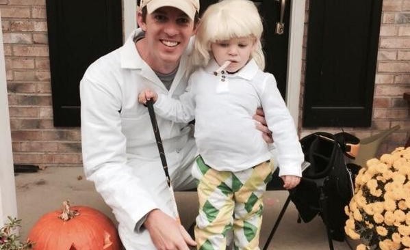 Nice spot by the Golf News Net and thanks to reader Steve for sending along this gem of a Halloween costume. It seems one Jonathan Trunk entered his 2-year-old son into Rock Bottom Golf’s John Daly Halloween dress-alike contest.
And Patrick Reed Was Doing So Well, Too, Files…
/Bishop The Blogger Is Back: "First Day of the Rest of My Life"
/The Open Unveils New "Brand Identity" Which Is A Nice Way Of Saying They Finally Dumped That Awful Logo
/Sam Weinman gives the new Open Championship logo a thumb's up in reporting on the R&A's unveiling of a new "brand identity" and I'd go a step further and say the move goes form a genuinely hellaciously awful logo to something that, with a simple font change, finally captures the aura of The Open (and that you wouldn't be embarrassed to wear on a cap).  The R&A's release on the new logo. The rationale:
Designed to capture all the defining attributes of The Open and to communicate the Championship's unique heritage to golf fans the world over, the new brand identity was delivered by two London agencies, teamup and Designwerk, who have created brand identities for some of the world's leading sporting properties.
It took two agencies to figure out a better font? Oh well, whatever it takes as long as we aren't paying for it.
Peter Dawson, Chief Executive of The R&A, said, “We know that fans of The Open share a tremendously strong connection with the Championship. The new branding celebrates the values long associated with The Open, the inspiration provided by great champions, the authentic and unrelenting challenge of links golf and the openness of our unique championship.
“The Open has enjoyed great success for more than 150 years and strengthening its brand will help to ensure its appeal continues to grow over the decades ahead. We believe the new branding will reflect an enhanced experience for the millions of golf fans who support The Open.”
Strengthening the brand=new and improved font. What a world.
There's some other particularly juicy jargon in the release about brand equity, the brand story, brand expression...oh screw it, you don't believe me do you?
Fred Popp, Chief Executive of teamup, said, “The Open has tremendous brand equity and is one of the world’s most cherished sporting events. Through its steadfast commitment to identifying the Champion Golfer of the Year, The Open is a celebration of golf in its purest form.
“As The Open’s lead brand agency, our work included the development of the brand story, definition of the brand expression and the resulting logo that delivers on the Championship’s rich history and heritage, fit for audiences in the digital age. teamup is thrilled to have played a part in helping The Open further strengthen its ambition and unshakable commitment to the sport and fans of golf everywhere.”
Just a babbling brook of...
Anyway, The Open is sporting a new and much improved font. We're in!
The old one, lest you forget...
 If you have three minutes of your life you'd like to never have back, there's also a brand identity launching video.


